It’s mid-December, so that means another count-down of my favourite movie posters of the past year! In case you’re unfamiliar with how this works, I spend the year trolling through impawards and collecting all the really cool, interesting and striking poster designs for 2024 movies and then narrow them down into a shortlist. As always, any poster released during the year is eligible to make the list, but special consideration is given to posters which are intended for mass distribution rather than posters which are intended to be limited-release, alternative, “artistic” posters. As usual, you can see the full-sized poster in all its glory if you click on the images.
Anyway, with those considerations out of the way, let’s get onto the list, starting with some dishonourable mentions:
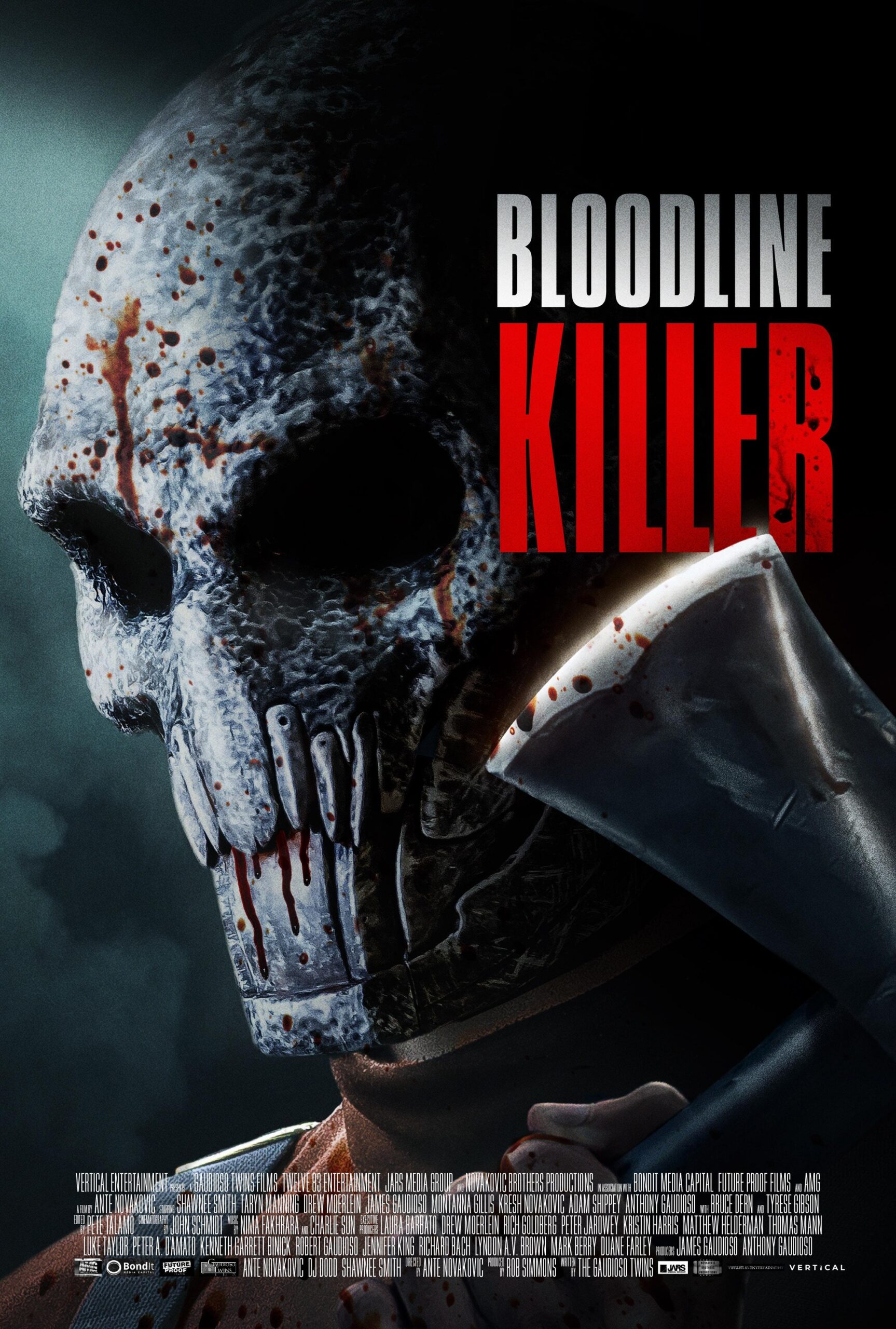
Bloodline Killer is a badass title for a horror movie, and this poster is trying its damnedest to be edgy, but it just comes across as goofy to me. Maybe this movie is good, but this poster sure as hell isn’t making that case for me (also, that axe head is tiny).
“OH FUCK ME“, I literally said when I saw this poster with Matt Walsh’s shitty, fucking face plastered on it. All that this poster makes me want to say, upon seeing it, is “yes, you are, you piece of shit”. That said: I’ve heard that the movie is not nearly as bad as it looks. I may, in legitimately good faith, check it out just to see if that’s true.
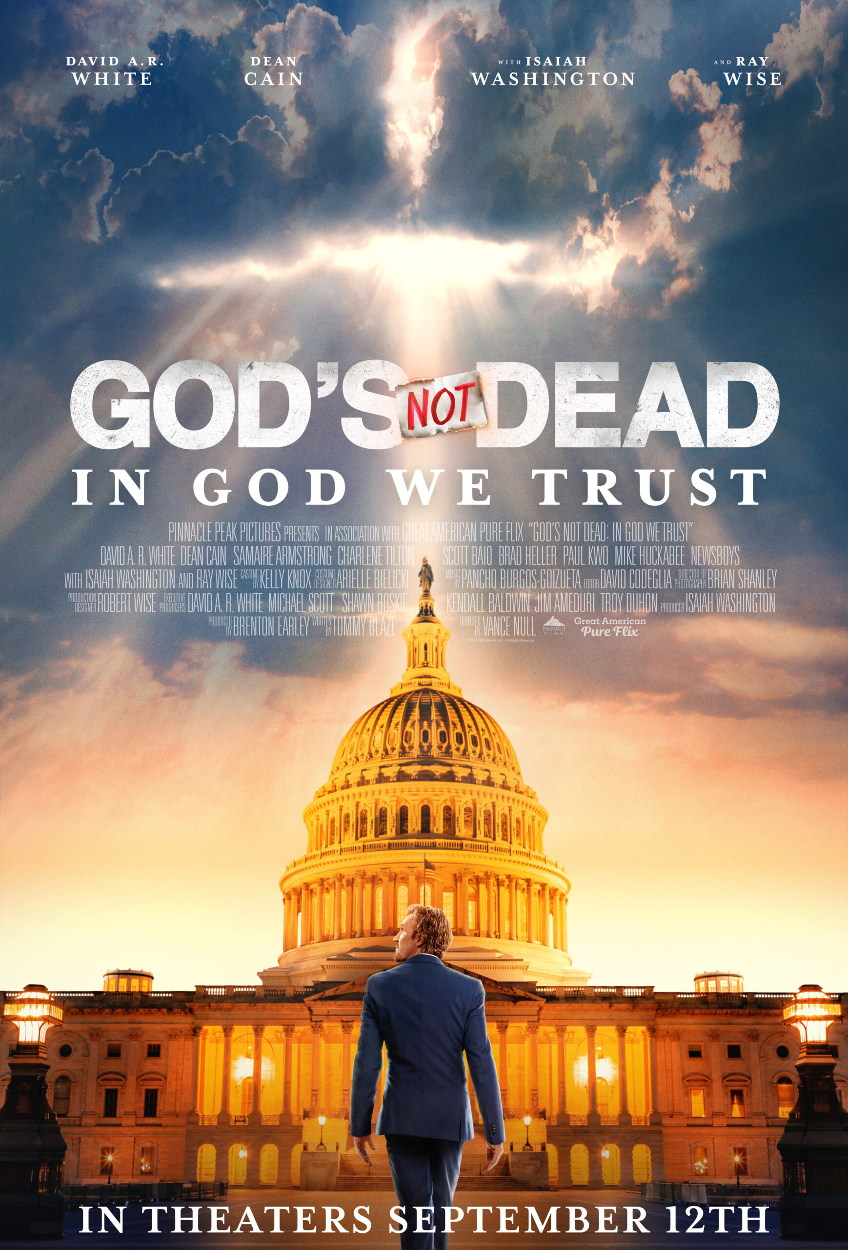
Yeah… they’ve made another one of these movies (two, actually, since I last covered the series). Unfortunately, God’s Not Dead 3‘s more moderate message was rejected by the audience, so they went back to full-on conservative circle-jerking for these last two movies. In God We Trust appears to be the most overtly-political of them all, featuring Pastor Dave trying to run for office… good fucking God, given how bad the other movies were, I cannot begin to imagine how awful this one will be. I am probably going to do another Retrospectives catch-up in 2025 covering all the new movies in existing Retrospectives series, so expect more suffering from me when I get around to watching this…
And with that said, let’s get into our top 15 proper:
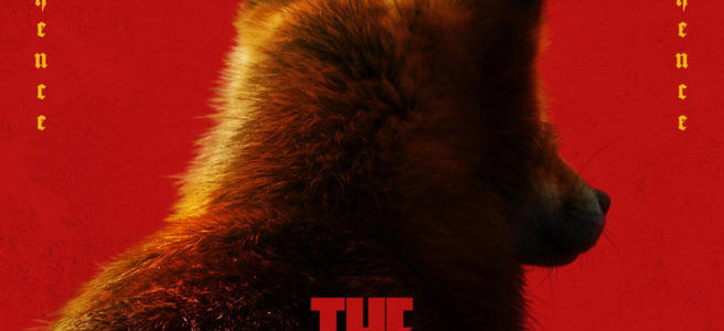
15) The Wild Robot
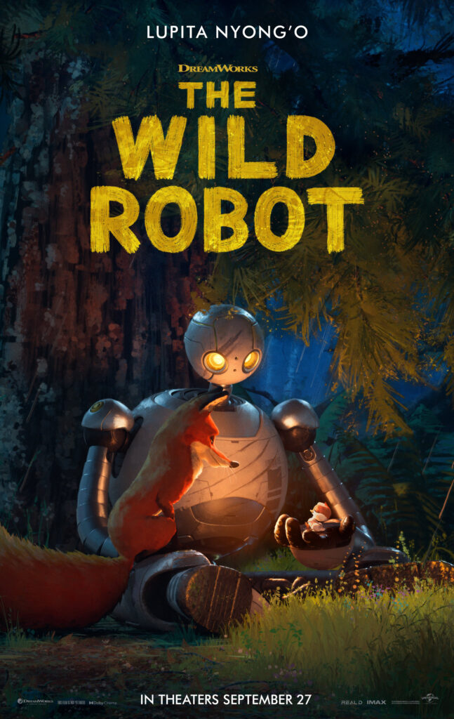
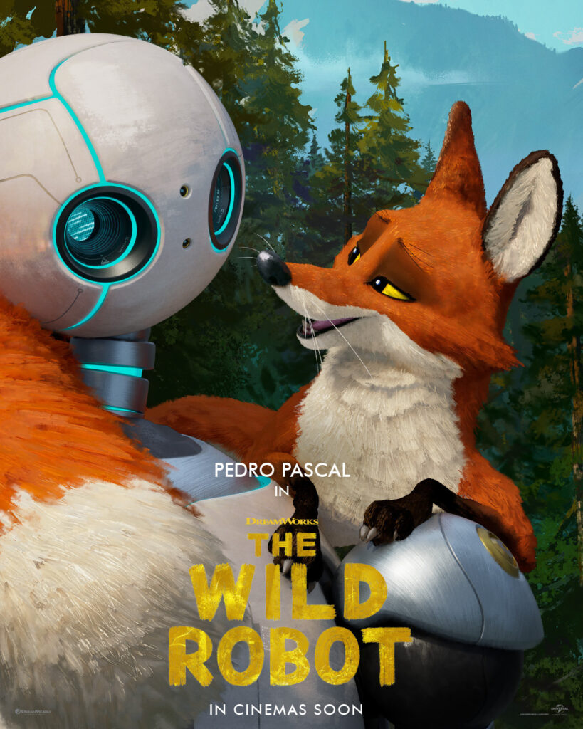
I’ve said it before and I’ll say it again: I’m a simple man. You put a cute fox on your movie poster, and you’ve instantly caught my attention. That said, these posters genuinely do a great job selling the movie: a sense of wonder, joy, and mystery with charming characters, reminiscent of The Iron Giant. Hell yeah, I’d love to see that, sign me up.
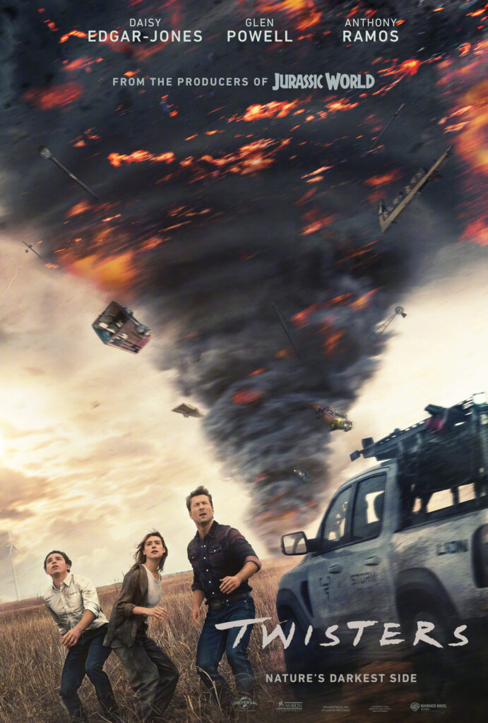
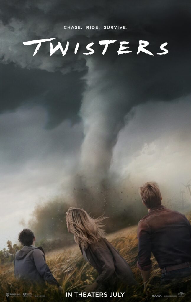
14) Twisters
Twisters made for a pretty good, back-to-basics summer blockbuster. Lots of excitement and mayhem, with a fun, Hallmark-style romantic drama at its center. These posters for Twisters do a good job of letting you know what you’re in for: the wonder and terror of nature, and how powerless our heroes will be in the face of it. Also, probably goes without saying, but the posters hearken back to the iconic poster for Twister, so it also promises to be a good time like that movie was (I’d say they succeeded).
13) Alien: Romulus
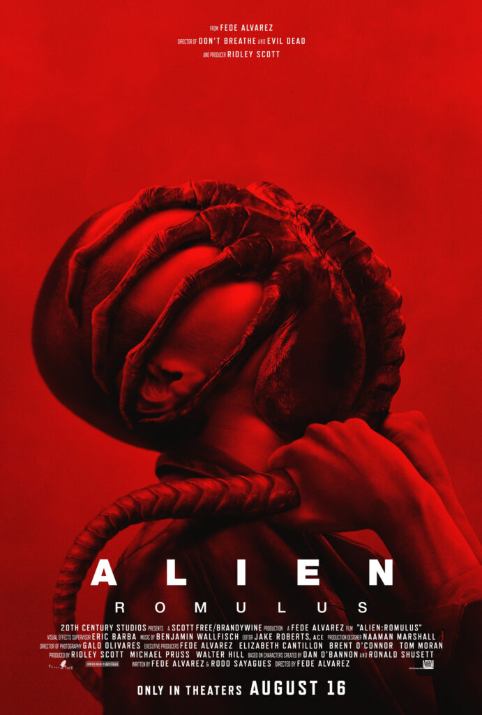
Even if you know nothing about the Alien movies, this poster for Alien: Romulus is uncomfortable. If you do know what a Facehugger does to you, this poster is downright disturbing. The overwhelming red gradient makes the poster eye-catching, while also feeling threatening and alarming. A very well-composed and considered poster all-round, does a great job appealing to Alien fans and general horror audiences too who may be less familiar with the franchise.
12) Destroy All Neighbors
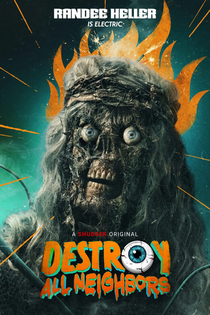
This year’s “what the fuck is this movie!?” poster, Destroy All Neighbors is certainly eye-catching. Initially this appeared blasphemous – the guy looks and is posed like zombie Jesus. However, after a bit more analysis, I think the guy got electrocuted, which burned his face off? It looks pretty wild and wacky and it makes me kind of want to know what the hell is going on in this movie.
11) Despicable Me 4
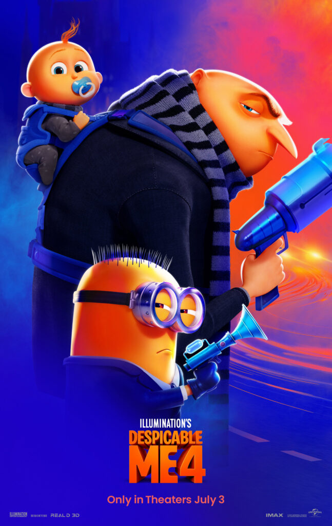
I haven’t cared about Despicable Me since the first movie came out, but I will say that this poster is pretty cool. I like how they’ve composed the image: first you look at Gru, then the goofy minion trying to look like a badass, and then up to the baby. Really sells what this movie’s going for: a colourful, light-hearted, comedic, family-friendly spy caper.
10) Furiosa: A Mad Max Saga
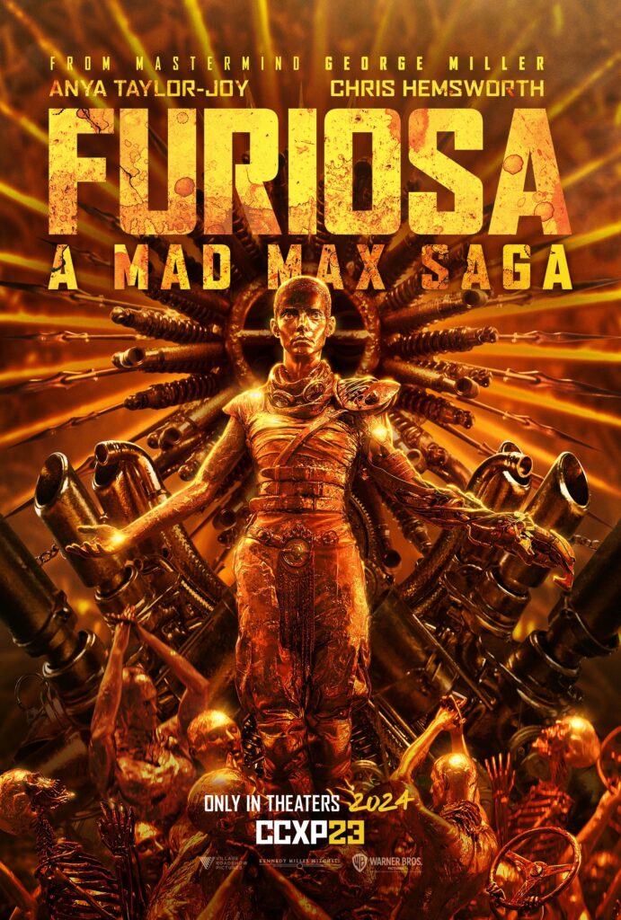
While not as grand as some of the posters for Fury Road, I kind of like that Furiosa is going for its own thing here. Furiosa is posed like a saint in a medieval painting, a connection which is only reinforced by the adoring skeletons and war boys at her feet. The car parts everywhere remind the audience that high-octane vehicular action is at the core of this series’ identity. Having everything in the poster be made out of gold highlights this film’s turn into grandiose myth-making. It’s a very cool poster in its own right, the sort of thing you’d be stoked to mount on your wall, but the extra depth just makes it all the better.
9) The Apprentice
Admittedly, I didn’t want to put this film on the list. I was sick of Donald fucking Trump in 2017, I sure as hell did not want to see his stupid, fucking face when this movie came out, and the 2024 election results have just made me hate the idea of anything Trump repulsive. That said, when I had to make my list, I couldn’t help but begrudgingly accept that this is one of the best posters of the year. It’s appropriately gaudy, invoking the desperation of Trump to appear rich. Sebastian Stan looks perfect as Trump, to the point where I kind of want the movie to turn into Inglourious Basterds in the third act… Jeremy Strong looming over it all makes you wonder what part he has in shaping Trump as well. As much as I hate to admit it, this is really solid poster.
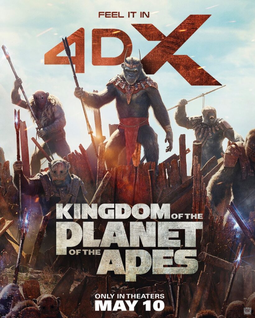
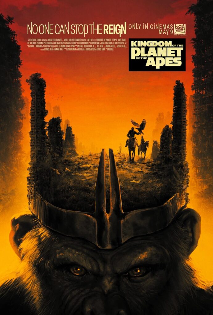
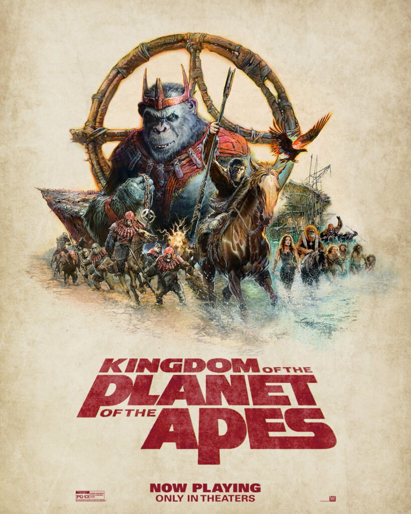
8) Kingdom of the Planet of the Apes
I am happy to report that the latest Planet of the Apes film had some of the most visually-interesting posters of the year. I particularly like the center poster, which references the colours and composition of the original film’s poster, while also working in a destroyed cityscape and the main characters. I also really like how much they set the king ape up as a real sinister bastard. Considering that the previous films set the apes up as the good guys, it’s good to remind the audience that there’s going to be a shift in tone going forward, with the established moral lines being much more grey. I haven’t actually gotten the chance to see Kingdom yet, but these posters certainly suggest that it will be a good time.
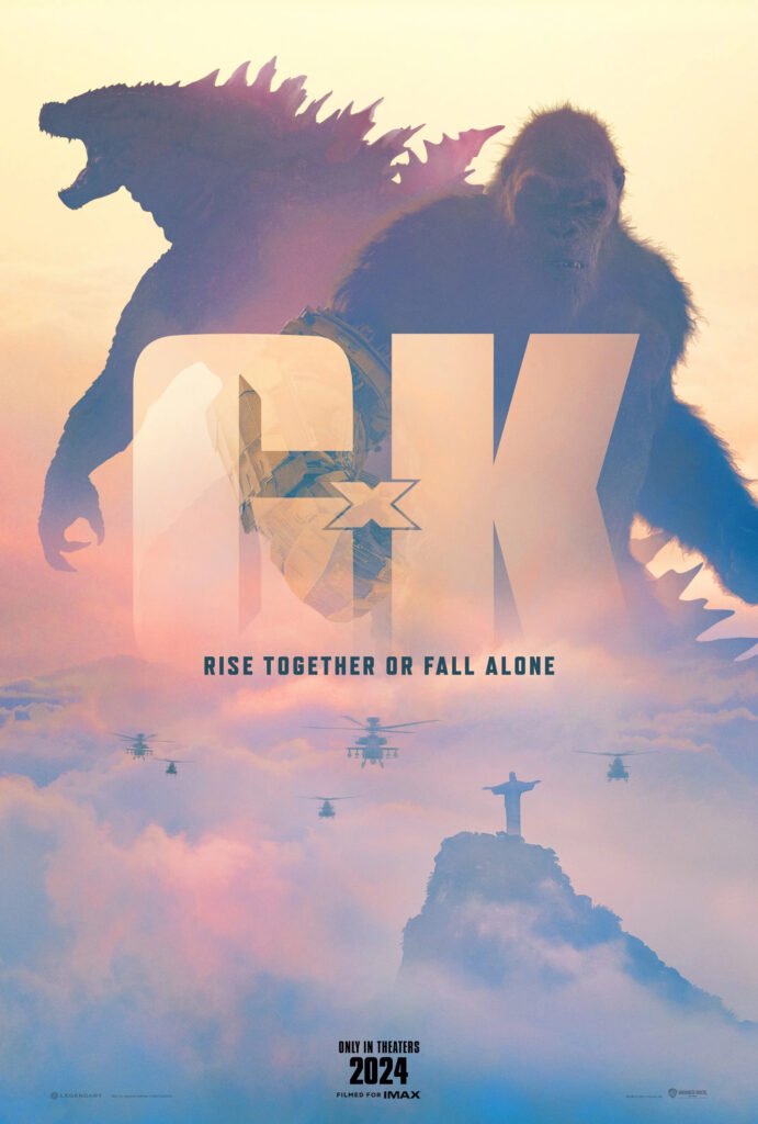
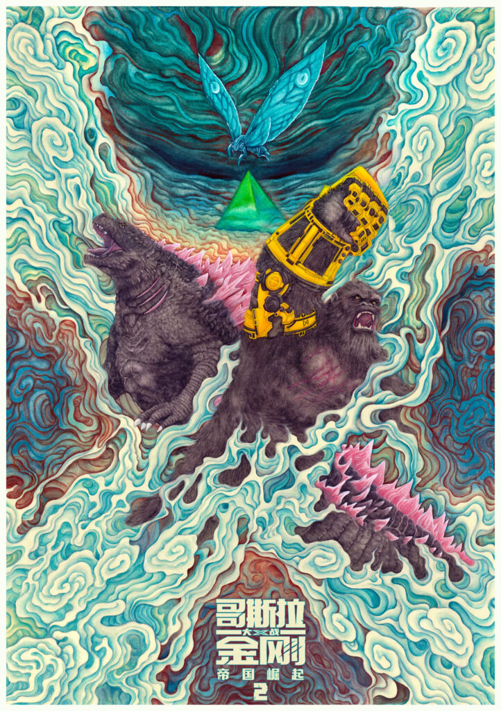
7) Godzilla x Kong: The New Empire
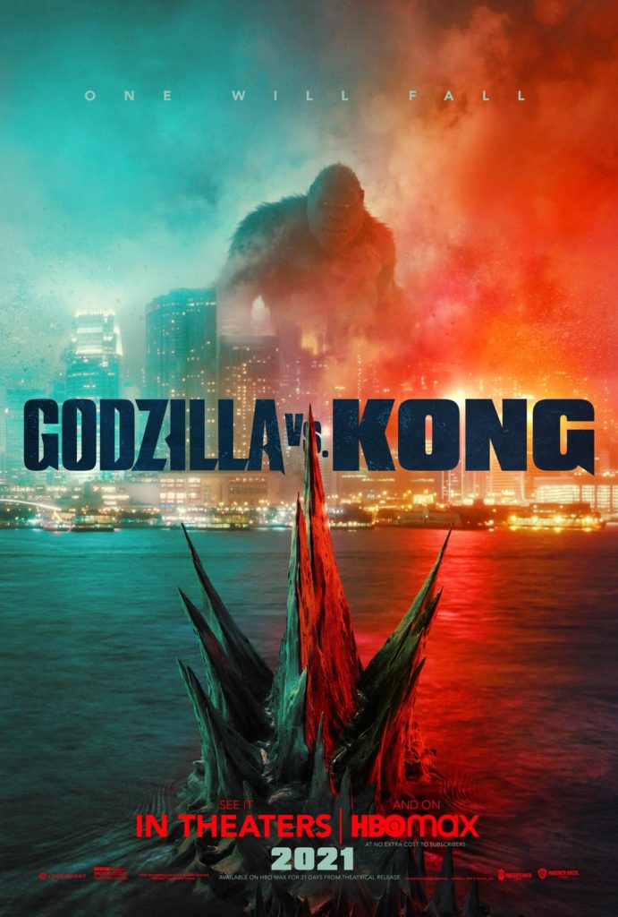
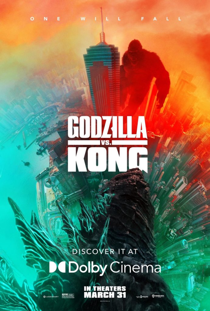
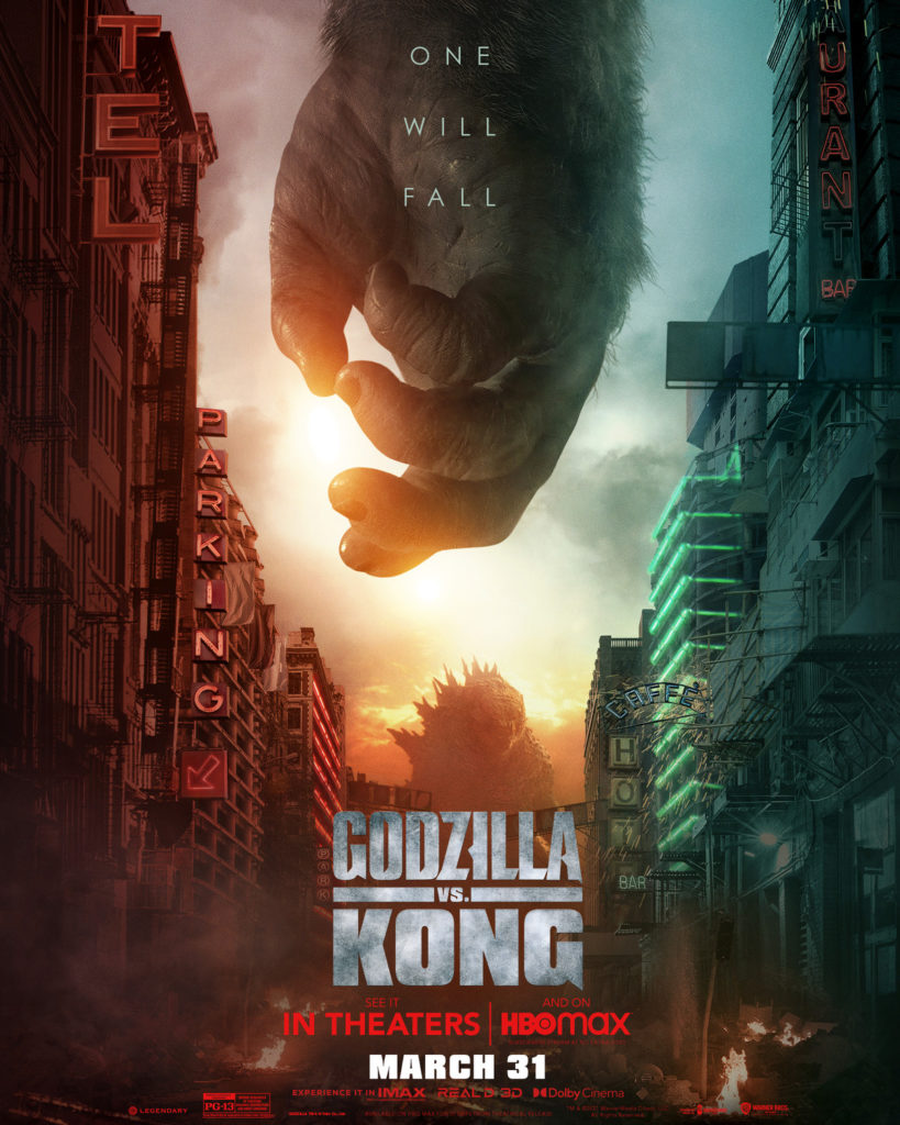
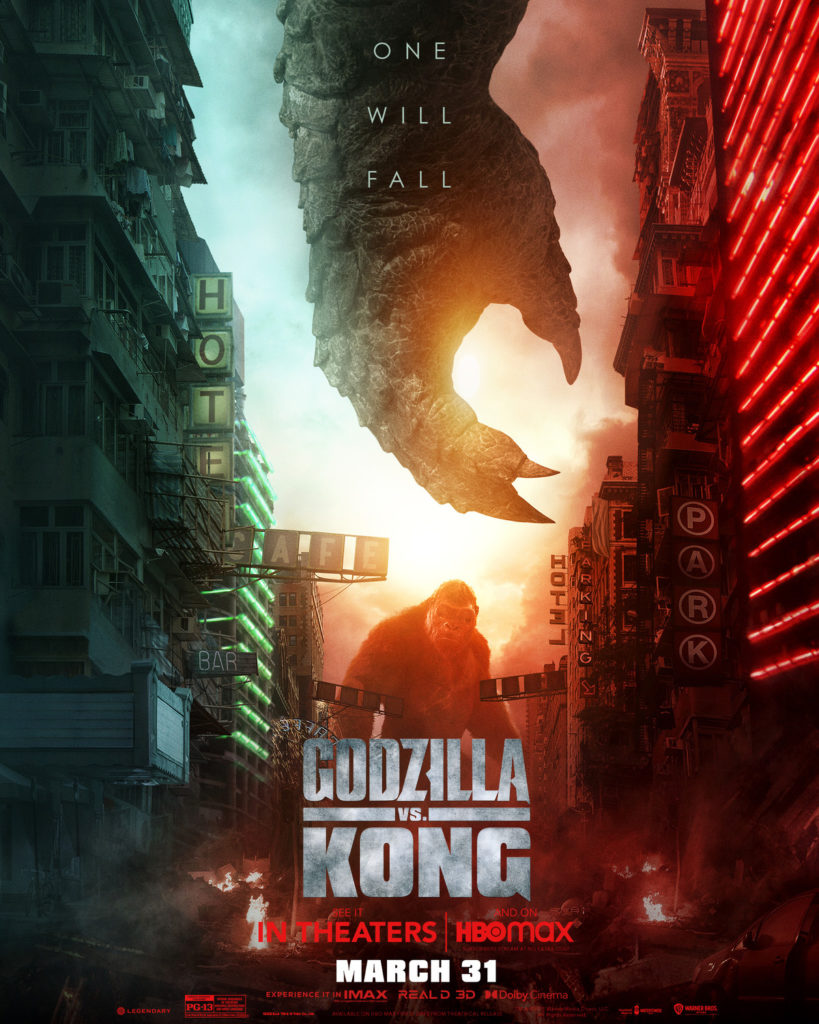
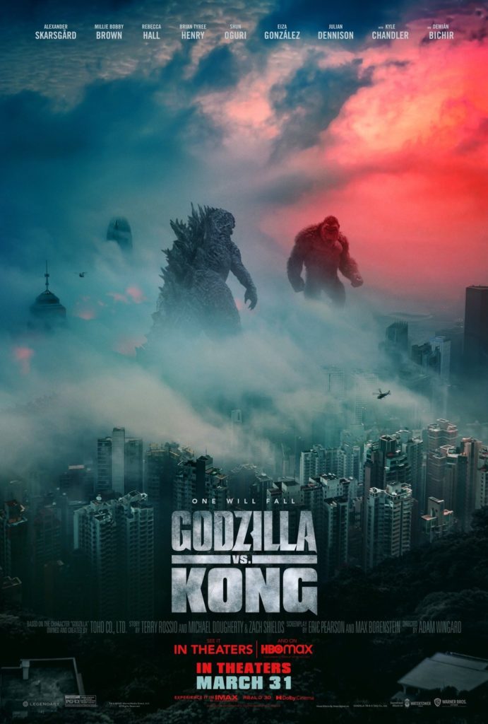
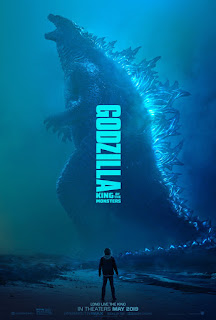
A new Monsterverse movie released this year and, once again, the marketing team was on-point, giving us some of the most visually striking posters of the year. While I do think that Godzilla x Kong‘s posters are a step down from their previous work, and they haven’t given us anywhere near the same number of absolute bangers, what we did get still looks really cool. Hopefully next time they step their game up a bit more, because I’d love to see Godzilla top one of these count-downs once more.
6) Art of a Hit
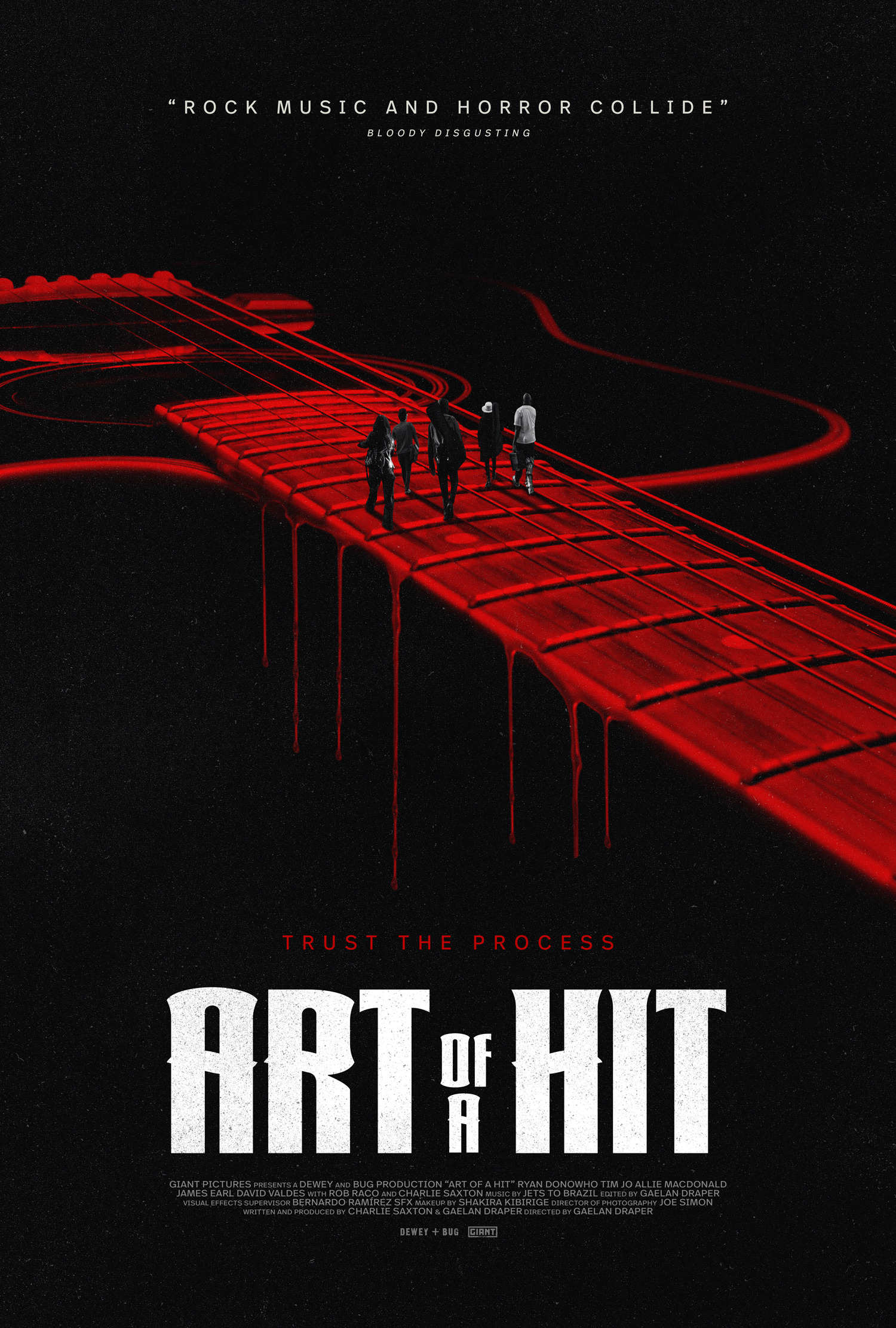
Like Alien: Romulus, Art of a Hit uses red to invoke threat and alarm. Unlike Alien: Romulus, I do not know what this movie is about, and it makes my mind brim with imagination. We’ve got five characters, presumably a rock band central to the narrative. The guitar is dripping blood, suggesting that this isn’t just a standard music biopic – some pretty nasty events are going to play out. The title itself is clearly a double-entendre, promising murder will be involved. I had never heard of this movie, but this poster legitimately has got me interested, which means it’s doing its job. Bravo, poster.
5) Back to Black
I do not particularly care about Amy Winehouse’s music, but damn, even I am impressed by how perfectly they’ve transformed Marisa Abela to look like her for this poster. I also appreciate that they’re being respectful here – they don’t invoke the a lurid, grimy side of Winehouse’s life here. Instead, they celebrate her at her peak, the best image of her that the public would have seen. Sure, it’s probably all in service of yet another Oscar-bait music biopic, but this poster is at least promising.
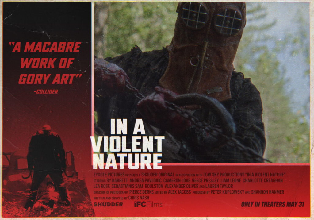
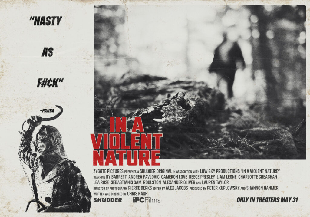
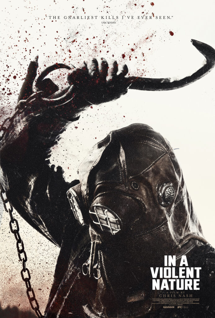
4) In a Violent Nature
Speaking of grimy posters, In a Violent Nature‘s posters absolutely deliver what you’d want to see out of a brutal, old-school slasher film. I especially like the first two posters, which use evocative, messy stills to invoke 70s grindhouse film advertisements. They don’t show too much directly, but the implications are all there that you’re in for a bloody, nasty time. The third poster is more modern and conventional for a slasher film, reminding me of the sorts of posters we got for My Bloody Valentine 3D. All-in-all, these are some pretty impressive posters for an indie slasher film, easily some of my favourites of the year.
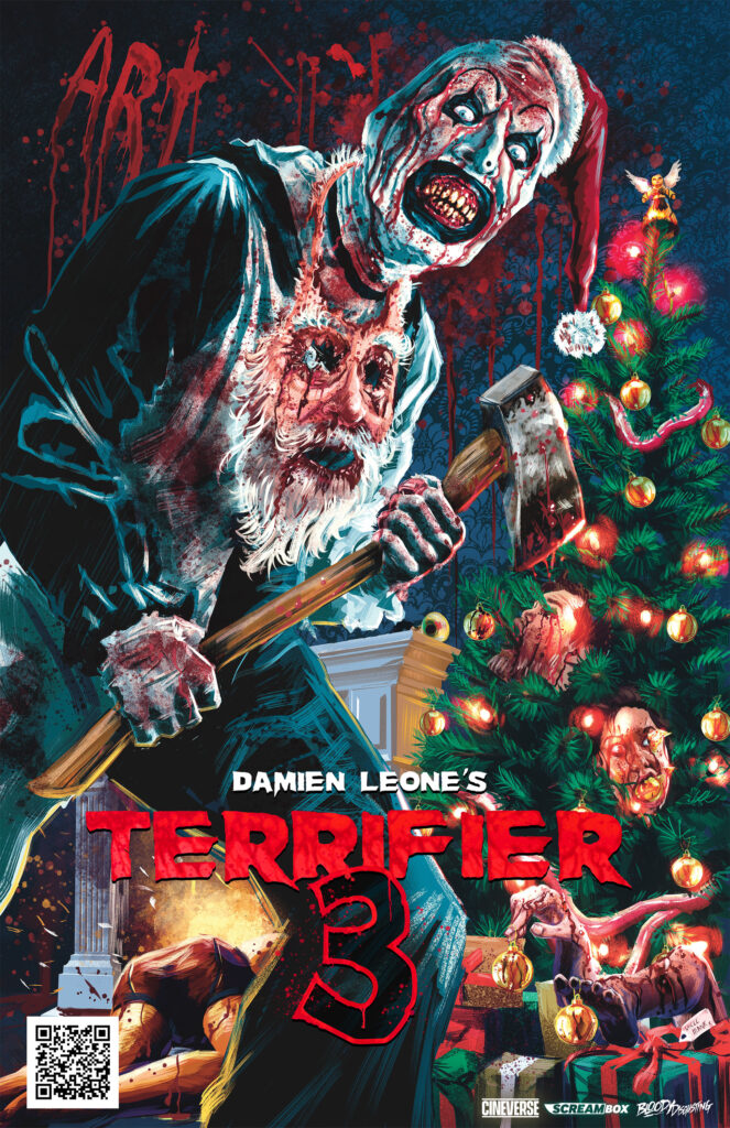

3) Terrifier 3
Of course, as far as grimy, nasty, old-school posters go, it would be pretty hard to top Terrifier 3. True to form, these posters are fucking gross, which is entirely appropriate for a Terrifier film. I’m not a huge fan of art that is shocking and violent solely for the sake of getting people offended (Crossed, Cannibal Corpse’s entire discography, etc), but these posters are absolutely warranted in the case of Terrifier 3, considering that they intentionally market this franchise as “movies so shocking that only the most hardcore of audiences can make it through them”. The Christmas imagery just makes this even more offensive, likely intended to be evocative of the moral panic which occurred around Silent Night, Deadly Night.
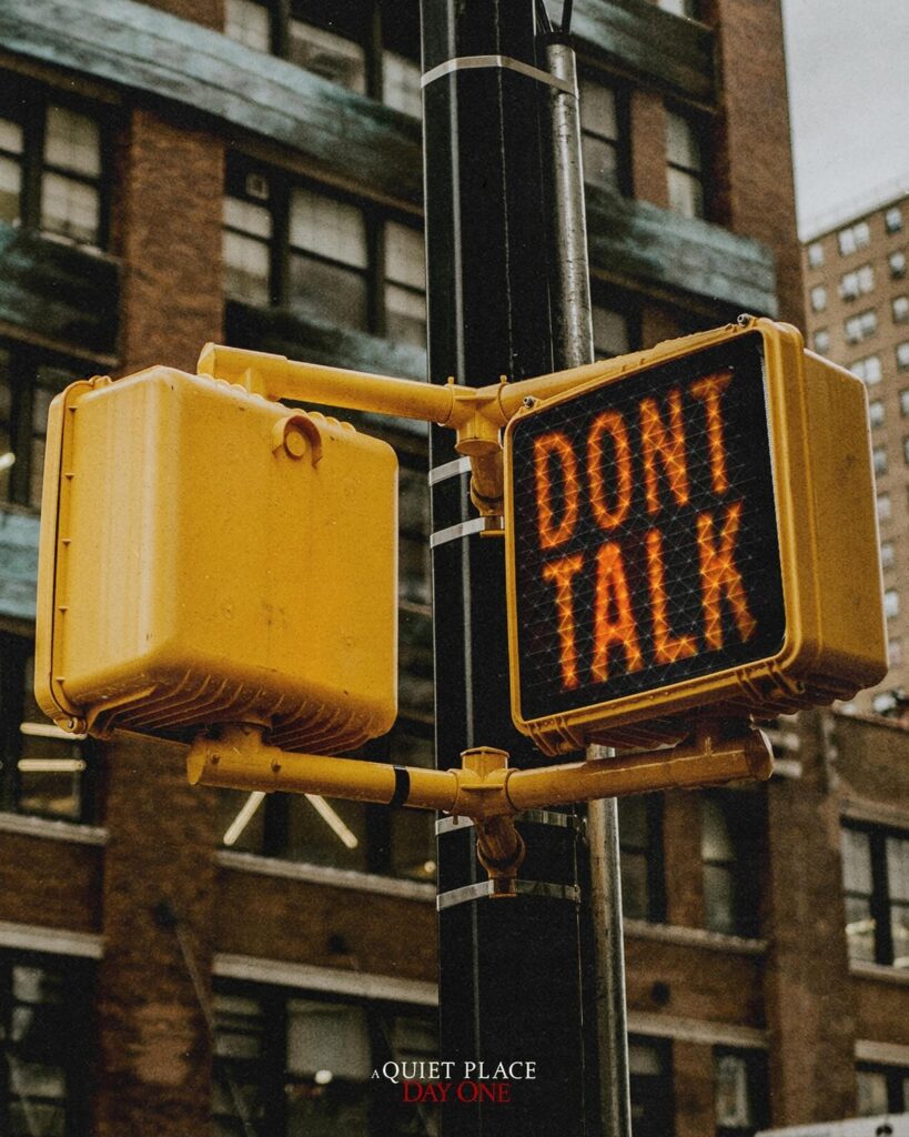
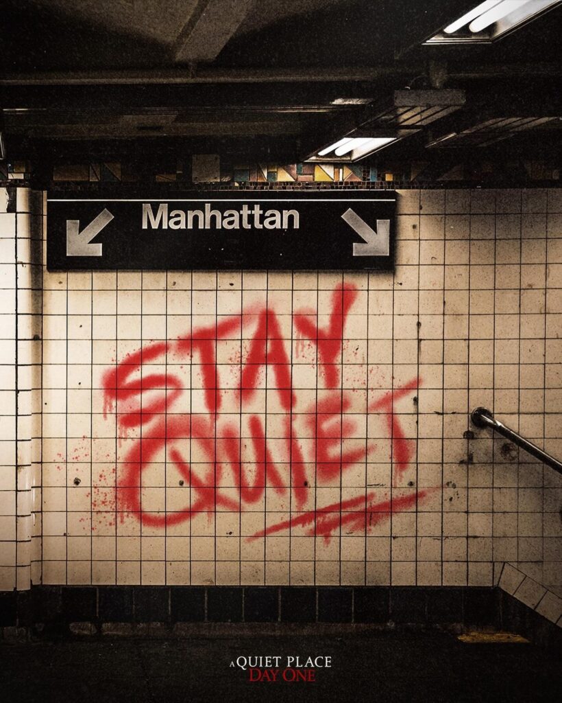
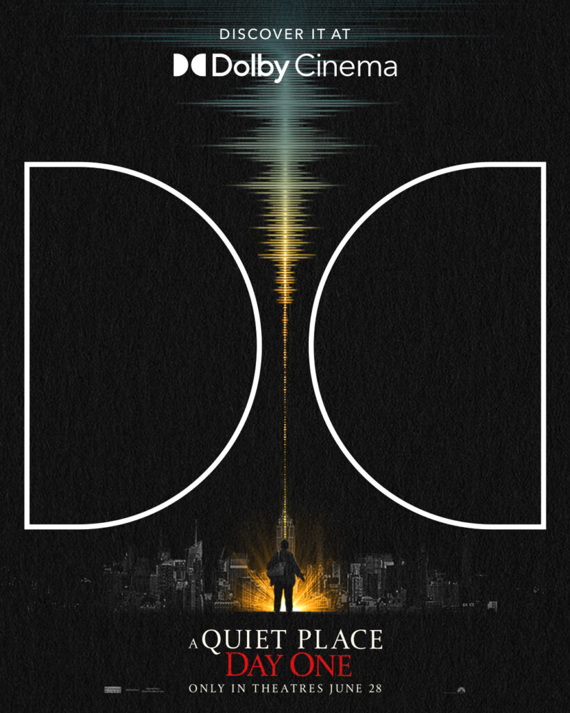
2) A Quiet Place: Day One
In an industry inundated with meaningless character posters and Drew Struzan rip-offs, I am always a sucker for a good “simple” poster, which A Quiet Place: Day One nails beautifully. You will see the image and the warnings before you realize what movie is being advertised, due to the small title. In my opinion, this makes them much more effective. In addition, they also have some more subtle additional details about the film’s setting and the importance of obeying the “rules” to survive in this world. As for the last poster for Dolby Cinema, it’s very much an ad (the double-Ds take up more real estate than the actual movie being promoted), but I love how elegantly it communicates the importance of sound in these particular films. It straight-up sells me on the idea that, yeah, seeing this movie in Dolby Cinema would probably be the ideal way to go about it.
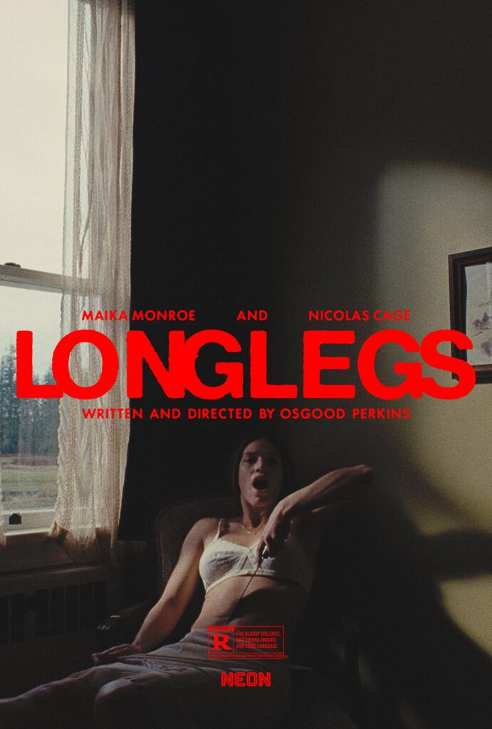
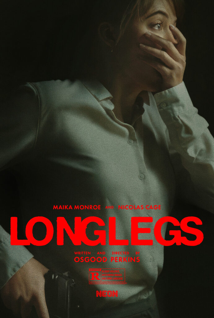
1) Longlegs
These posters for Longlegs perfectly combine my favourite things about a good subtle poster and a good horror movie poster. It reminds me a lot of 2018 best poster runner-up, The Clovehitch Killer, where the there isn’t really any one “thing” going on with it to tell you what the movie is about… however, the image is so beautifully shot and composed that it communicates far more than you might expect at first glance. The first poster is downright disturbing – why the fuck is she holding that knife to her belly?! That doesn’t look like the face of someone who is scared. The implications are profoundly unsettling. Meanwhile, the poster featuring Maika Monroe is just her reaction to something horrifying. We see that she has a gun, and she’s still terrified. Naturally, this gets your imagination going, wondering what she could have seen: did she see the end-result of the previous poster? I don’t know, but it is very effective.
If you liked this article…
I hate ads. You hate ads. In order to stop polluting my site with obtrusive and annoying ads, I’ve elected to turn them off on IC2S. That said, writing still takes time and effort. If you enjoyed what you read here today and want to give a token of appreciation, I’ve set up a tip jar. Feel free to donate if you feel compelled to and I hope you enjoyed the article! 🙂
























.jpg)
